New UK Nike Logo

MWes11

Heisman
Apr 22, 2012
12,025
10,106
0
Kentucky Athletics ‏@UKAthletics 17m17 minutes ago
The #BBN is amazing. We wanted to wait to show off our new UK logo, but nothing gets past you. #WeAreUK #thanksnike
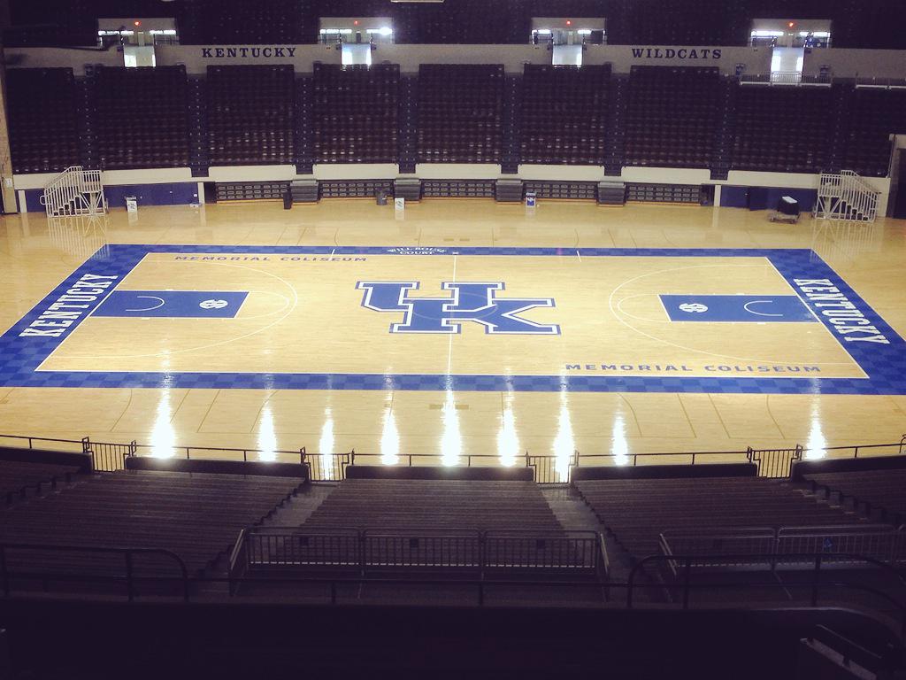


Someone help me out here. What am I missing besides the checkered sideline? Is the actual logo different at all?
 

EliteBlue

Heisman
Mar 27, 2009
16,751
20,269
0
Yeah I don't see it either. Maybe the white outline wasn't there before. Maybe the letters are a slightly different font.

Nike is so original
 

GLR5555

All-American
Apr 2, 2012
17,382
5,237
113
The K appears to be a different font. More of a horizontal slant in the middle.
 
Nov 15, 2008
38,645
57,515
0
Yep different font and slightly closer together/condensed.

Prefer the other myself - how about a throw back logo with merchandise Nike.
 

BOHICA_

Redshirt
Aug 14, 2008
4,361
2
0
The K in the interlocking UK symbol is hideous. I like the lettering in each endzone. It looks sharp but if there are plans to make the UK logo at midcourt the new logo, someone needs to scrap that and fast.
 
  • Like
Reactions: UKallDay

buckkiller

All-Conference
Nov 6, 2003
131,233
2,466
0
Looks like a 1st grader came up with it just like that stupid Bengals B! Looks like Junk need to get it fixed with a Wildcat in logo. We are the wildcats are we not?
 

O C-A-T-S 06

Redshirt
Mar 23, 2011
979
29
0
I know this is a basketball board, but how sweet would it be if they put the out of bounds lines as the endzones for the new turf in commonwealth stadium?
 

Honeydikkin79

Redshirt
Apr 17, 2015
137
34
0
Any way they could put the wildcat through the UK on our shorts this year? Or do fans not really like that logo?
 

gamalielkid

All-American
Mar 21, 2002
6,268
7,148
113
The person who thought this was neat needs to be fired immediately! The old interlocking UK is much cleaner, nicer, more modern, etc. Just pitiful. Do we have to hire IU graduates to design this stuff?

Go Big Blue!
 

ugliestmouse

Redshirt
Jan 3, 2003
1,336
0
0
I'm old, so I don't like it. I immediately saw it and instantly thought it looked a lot like the Houston logo.
 

UK1919

Redshirt
Feb 2, 2005
2,869
2
0
Most animal logos, and all of our past wildcat logos, look lame. Quit changing them! Not a thing wrong with the interlocking UK they just tweaked ( for what purpose? )
 

JasonS.

All-American
Moderator
Oct 10, 2001
41,863
7,306
66
I like it a little better than the old one. But I've never much liked the old one.
 

JasonS.

All-American
Moderator
Oct 10, 2001
41,863
7,306
66
I think it's a pretty safe bet the new Commonwealth Stadium field will look fairly similar to this.
 

Lord_Crow

Junior
Mar 25, 2015
923
298
0
Not a thing wrong with the interlocking UK they just tweaked ( for what purpose? )

Because now, even though the change is slight, people will recognize if you are wearing old stuff... so now you have to go out and buy all new stuff or you're a cheapskate that wears old gear.
 

ZaytovenCat

All-American
Apr 25, 2013
24,121
8,945
97
They better not change the floor in Rupp to that logo. I like the checkered outline but the new font on all the lettering sucks.