New UK Nike Logo

Feb 12, 2009
5
1
0
The old logo was looking dated, I'm glad they went with something new but subtle.

As a graphic designer I think it looks great. UK always seems to be a little bit behind the times when it comes to marketing/design/multimedia, but over the last few years things have improved quite a bit. I think Nike has a lot to do with that.
 

mashburned

Heisman
Mar 10, 2009
40,283
49,516
0
Need a rabid, flesh-eating, very, very angry wildcat, imo. Show these teams we mean business.
 

Rhavic

Heisman
Dec 15, 2014
33,418
23,865
68
Could be worse. They could have given us a purple vulture with teeth.
... A bird with teeth. What a silly *** logo.
 

GermantownDawg

Heisman
Sep 9, 2001
137,949
37,825
78

I miss this logo.
 
  • Like
Reactions: lonewildcat

elgribbo

Redshirt
Mar 31, 2010
1
0
0
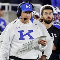
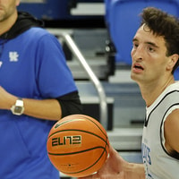
I'm ok with the chequered side lines and the font they used there but I agree that the new UK at center court blows. the K looks funky. Not real sure why any of it needed to be changed really.
 

UKnVT

Freshman
Aug 9, 2003
11,106
59
0
I'm torn on this.

I think the new "K" looks like crap. The font is just stupid.

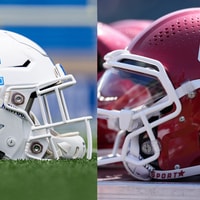
However, I do like that there is more blue and less white in the logo. I also like the slightly lighter shade of blue ... looks true Royal blue as opposed to the almost Navy it was turning into. The checkerboard borders actually look kinda cool to me, too, and I do like the endzone font WAY better than the old.

Overll, not bad, but the K sucks
 

buckkiller

All-Conference
Nov 6, 2003
131,233
2,466
0
What was it? A competition between kindergarteners see who could come up with a logo. Freaking WEAK!
 

bluehue

Redshirt
Dec 6, 2009
803
26
0
The K appears to be a different font. More of a horizontal slant in the middle.
LOL, at "horizontal slant", reminds me of "we're starting to show spurts of consistency".
Don't think the logo needed changing at all.
 

Brand New Merkin

Sophomore
Feb 15, 2007
66,603
100
0
Congrats to little old lady in UK's marketing department who JUST NOW realized you can change the font in Photoshop!
 

ok-cats-computer

All-Conference
Oct 5, 2005
5,654
3,677
0
The new logo is terrible. It looks like a bad copy of the Houston logo. If this is what Barnhart puts on the 50 yard line in Commonwealth, it will look like garbage. I can't believe Kentucky actually paid a marketing company for this "new" crap logo.
 

Lord_Crow

Junior
Mar 25, 2015
923
298
0


The wildcat in this one looks like it is yawning instead of growling. So half-hearted looking rather than fierce.
 

JumoJulep

Senior
May 21, 2002
1,459
469
62
Nike is only allowed to do what UK allows and from the looks of the "changes", that ain't much! It would be more effective to give Nike the freedom to update and re-design the logo/wildcat image without restrictions. They have proven talent so let them design!

I think the logo is too low key and restrained, okay, boring. Should be bolder, more dynamic.
 

OHIO COLONEL

Heisman
Feb 11, 2009
14,803
59,401
0
Nike is only allowed to do what UK allows and from the looks of the "changes", that ain't much! It would be more effective to give Nike the freedom to update and re-design the logo/wildcat image without restrictions. They have proven talent so let them design!

I think the logo is too low key and restrained, okay, boring. Should be bolder, more dynamic.

If you gave Nike free rein, they'd have a new design monthly just to sell more stuff.
 

Raroyder

Freshman
Sep 17, 2002
2,186
61
0
Wait, why exactly is our 'K' broken now ? It looks like it had a run-in with the police
 

dbrice3

Sophomore
Mar 29, 2007
406
122
0
Not sure I ever would have noticed on my own.

Regarding penis tongue, that was circa 94-95? I recall that logo gracing the arboreteum water tower when the story broke. Anybody have the definitive history on that?