Helmet logo question

DovaDawg

Redshirt
Aug 28, 2007
595
0
11
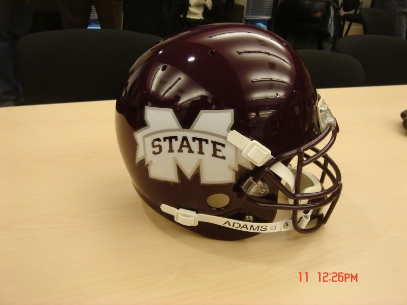
I thought the idea of the logo redesign was to help make Mississippi State a more recognizable entity. How is using a "washed out" M State going to help that? To the person that is non-familiar with MSU, they will not know what that logo is. This seems to be almost as bad an idea as the Ole Miss blob as it will only be a recognizable symbol to the fan base and those in the region.


</p>
 

dawgatUSM

Redshirt
Apr 6, 2008
3,835
27
48
I personally don't think it looks all that bad. but that's just me. it's much more modern...
 

was21

Senior
May 29, 2007
10,011
637
113
of the state of Mississippi and a Bulldog head and the word State. They might consider it, but probably won't because they know that I like it.
 
Maroon and White

Latest

  1. 01 Maroon and White "We gotta tackle better": Mississippi State CB Jett Jefferson diagnoses Week 7 struggles
  2. 02 Maroon and White Lebby, Mississippi State teammates back "Billy" Puckett after loss against LSU
  3. 03 Maroon and White Football Points of Focus: Mississippi State HC Jeff Lebby speaks on Oklahoma matchup
  4. 04 Maroon and White Football Mississippi State QB Kamario Taylor still "Day to Day" with no clear return timeline
  5. 05 Rivals Football Recruiting Edna Karr-Rummel Eye-Catchers: Georgia and Mississippi State commits shine, state's top offensive line and defense flex muscle, future stars emerge