Helmet logo question

DovaDawg

Redshirt
Aug 28, 2007
595
0
11
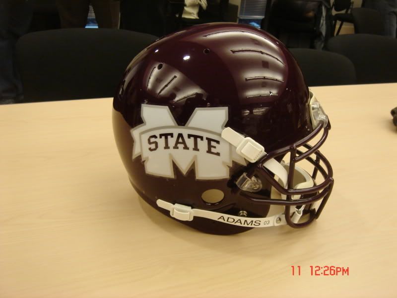
I thought the idea of the logo redesign was to help make Mississippi State a more recognizable entity. How is using a "washed out" M State going to help that? To the person that is non-familiar with MSU, they will not know what that logo is. This seems to be almost as bad an idea as the Ole Miss blob as it will only be a recognizable symbol to the fan base and those in the region.


</p>
 

dawgatUSM

Redshirt
Apr 6, 2008
3,835
27
48
I personally don't think it looks all that bad. but that's just me. it's much more modern...
 

was21

Senior
May 29, 2007
9,981
616
113
of the state of Mississippi and a Bulldog head and the word State. They might consider it, but probably won't because they know that I like it.
 
Maroon and White

Latest

  1. 01 Rivals Eye-Catchers: Ole Miss commit Elijah Cox, rising 2028 QB lead Westlake's impressive season-opening win
  2. 02 Maroon and White Jeff Lebby talks Mississippi State Saturday Scrimmage: "A ton of good on good"
  3. 03 On3 UNLV transfer forward Kimani Hamilton signs with Mississippi State
  4. 04 Maroon and White Mississippi State's WR room is a strength, the question is "how strong?"
  5. 05 Maroon and White OL Mario Nash Jr. no longer on Mississippi State roster