
View attachment 13579
Also, they've updated their standard script font from Copperplate to, I **** you not, "Sabon".
Also, they've updated their standard script font from Copperplate to, I **** you not, "Sabon".


Also, they've updated their standard script font from Copperplate to, I **** you not, "Sabon".

That big U always bothered me. It was disproportionate to the A.
I noticed fans a butchering the new look but it is a better rendition of the old. Perfect circles (or curves) are aesthetically pleasing to the eye...the bottom of the "U" accomplishes this. That alone makes it a better looking version.View attachment 13579
Also, they've updated their standard script font from Copperplate to, I **** you not, "Sabon".
I think yall all missed the part where they also changed their font to "Sabon"
Exactly, my guess is getting rid of those white triangles was what started this whole thing. While it doesn't seem major it is a good change from a design perspective. Pre-computer graphics there were a lot of things that didn't matter that do now. Your logo has to be displayable in any size and the consistent curves and lack of odd white space areas makes it a better overall logo.the white part of the ua is now an upward pointing arrow. it also eliminated the white triangles between the a and u which im sure helped with printing and embroidery (read licensing) capabilities

LMAO are you from AL? I'm not sure how anyone that's not an Auburn fan would ever notice that?.
That big U always bothered me. It was disproportionate to the A.
"Tradition, something you as a State fan wouldn't understand", is his go to answer for just about anything. The guy is a homer about things Auburn related.
That big U always bothered me. It was disproportionate to the A.
View attachment 13579
Also, they've updated their standard script font from Copperplate to, I **** you not, "Sabon".
View attachment 13579
Also, they've updated their standard script font from Copperplate to, I **** you not, "Sabon".

Yup. Hail dear ole Mississippi State JuniverstiyThey did the opposite of what State did in the 90's. It's like they went from
View attachment 13617
To
View attachment 13618
They did the opposite of what State did in the 90's. It's like they went from
View attachment 13617
To
View attachment 13618
 Maroon and White
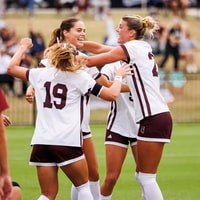
Mississippi State Soccer upsets No. 6 Alabama in regular season finale
 Maroon and White Football
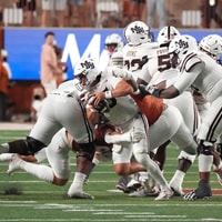
Mississippi State PFF Grades from 31-3 loss at No. 11 Texas
 Maroon and White Football
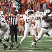
Mississippi State's offense is missing identity and running out of time
 Maroon and White
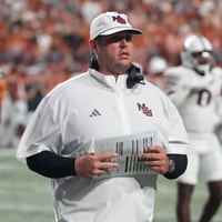
"We have to make the layups": Mississippi State HC Jeff Lebby laments missed opportunities again at Texas
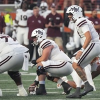 Maroon and White
Rapid Recap: No. 11 Texas 31-3 Mississippi State


