
Wtf..it is hurting my eyes. Why are their different colors along the baseline making it not only distracting but hard to tell where it starts..why would someone come up with a court design like that
 The Knight Report
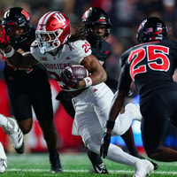
Rutgers Football Postgame Show: Indiana Hoosiers Edition - TKR Pod
The Knight Report
Rutgers Football Postgame Show: Indiana Hoosiers Edition - TKR Pod
 The Knight Report
Join The Knight Report TODAY and get it for 60% off!
The Knight Report
Join The Knight Report TODAY and get it for 60% off!
 The Knight Report
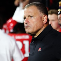
Rutgers Football HC Greg Schiano's Indiana Postgame Press Conference
The Knight Report
Rutgers Football HC Greg Schiano's Indiana Postgame Press Conference
 The Knight Report
Rutgers Football crushed by defending NCAA champ No. 6 Indiana
The Knight Report
Rutgers Football crushed by defending NCAA champ No. 6 Indiana
 The Knight Report
How to watch Rutgers / Indiana; Pregame Info, Spread, More: Gameday Central
The Knight Report
How to watch Rutgers / Indiana; Pregame Info, Spread, More: Gameday Central
