Just rewatched the LSU overtime and the power K looks 1000% better than the UK logo.
The Power K
- Thread starter Get_over_it
- Start date
You are using an out of date browser. It may not display this or other websites correctly.
You should upgrade or use an alternative browser.
You should upgrade or use an alternative browser.

You are so right. Uniform was the absolute bombJust rewatched the LSU overtime and the power K looks 1000% better than the UK logo.
That was the best home uniform we’ve worn in years.
I wish we’d make it permanent.
I wish we’d make it permanent.

This new administration seems to actually listen to the fans input, so there's hope they make the change permanent. At the very least get rid of that damned two birds logo...it's the absolute worst

🫡This new administration seems to actually listen to the fans input, so there's hope they make the change permanent. At the very least get rid of that damned two birds logo...it's the absolute worst


Lane Kiffin's tears... lolWhat give's it it's power?

Need to see that on a basketball uniform. Noticed recruits are taking pics with it, maybe nike will come up with something for basketball.

No it really doesn't. Copium --------------->Just rewatched the LSU overtime and the power K looks 1000% better than the UK logo.
Ladies and gentlemen, Phil Knight.No it really doesn't. Copium --------------->
The birds humping logo has been around since 2016, looks too much like AI copied the K-State logo to be less blocky, and has run it's course. It's time for another "modern" rebranding with Nike. Love the Power K as a throwback uniform, but not an everyday uniform. Much like the Denims in Basketball. Like it for one game, but it wouldn't work as the base uniform every night. The "Phallic" Tongue Cat probably isn't coming back either. The current interlocking UK looks too much like Houston's logo. Some teams can get away with the same logo for 75 years and unchanged uniforms (Alabama), some teams do too much with experimental uniforms (Oregon), but staying modern and looking "good" to potential recruits is pretty important.


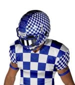
I don't think we ever went far enough with the checkerboard idea. These concept uniforms really pop. They'd look even better with Kroger and the "birds having sex" wildcat logos on them.
I gotta be real with y’all Power K kinda ugly I hope they don’t make it permanent anything but I wouldn’t mind seeing it more a lot more often
yes the one looks like birds making love but it’s a lot cooler
yes the one looks like birds making love but it’s a lot cooler
This would be good for TN it it were orange as looks like prison uniforms.I don't think we ever went far enough with the checkerboard idea. These concept uniforms really pop. They'd look even better with Kroger and the "birds having sex" wildcat logos on them.
View attachment 1505708
How is the power K ugly? I can understand bland perhaps but ugly?I gotta be real with y’all Power K kinda ugly I hope they don’t make it permanent anything but I wouldn’t mind seeing it more a lot more often
yes the one looks like birds making love but it’s a lot cooler
It’s a little bit of both I hate how it looks like an I with a weird thing hanging off of it, the middle of it is like off center or something in comparison to the modern UK logo.How is the power K ugly? I can understand bland perhaps but ugly?
I don’t hate it entirely, I’d be fine if we played quarter to half of the games in it but I saw people saw they want to replace the modern logo entirely even on the basketball jerseys but I’m simply not nostalgic enough to like it that much.
Vhcat1970 ^ comment above me talking about putting it on every basketball jersey must either be old or likes ugly designs

Well you’re in the VAST, vast minority. Matter of fact there are so few of you who thing that it doesn’t even make a minority. It’s not the power K that’s the issue, your taste just doesn’t hit the mark. The power K was praised as a fanbase, across the state, and nationally. The players LOVED that uniform. I am friends with a UK D lineman, he said the players thought it was the best they’ve worn yet. Like I said, it’s just you.It’s a little bit of both I hate how it looks like an I with a weird thing hanging off of it, the middle of it is like off center or something in comparison to the modern UK logo.
I don’t hate it entirely, I’d be fine if we played quarter to half of the games in it but I saw people saw they want to replace the modern logo entirely even on the basketball jerseys but I’m simply not nostalgic enough to like it that much.
Vhcat1970 ^ comment above me talking about putting it on every basketball jersey must either be old or likes ugly designs
The power K uniform and helmet is by far the most popular look bar none, period. So you’re entitled to your opinion but if an opinion on taste could be wrong, it would be yours.
Coming back from the LSU game, it’s all fans in Lexington were talking about. Going to work that Monday, it was the only thing people I work with were talking about. There is no getting around how beautiful and awesome the power K is.
Latest
-
01
 KSR Basketball
LIVE BLOG: Kentucky takes on UCF in exhibition finale
-
02
 KSR Football
Everything Will Stein has to say on the SEC Teleconference
-
03
 KSR Basketball Recruiting
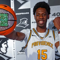
5-star center Lewis Uvwo commits to Providence
-
04
 KSR Basketball
No KSR Pregame Show tonight, but there WILL be a Postgame Show
-
05
 KSR Women's Basketball
Kentucky WBB's point guard position will be run 'by committee' to begin season