Does anyone else think they suck? Don't even look like a wildcat !!!!!!!!!!!!!
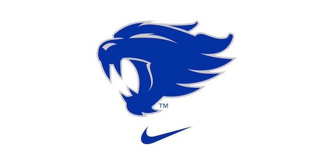
NEW LOGO
- Thread starter gonegone
- Start date
You are using an out of date browser. It may not display this or other websites correctly.
You should upgrade or use an alternative browser.
You should upgrade or use an alternative browser.

UK thundercats
Seems a lot of people like it. Myself included. It's different enough than the other schools and their logos. People need to put them side by side. Problem is, UK should have had a logo like this years ago.
Does anyone else think they suck? Don't even look like a wildcat !!!!!!!!!!!!!
They suck in spades. I hope to hell that does not become the official logo.
awful. modeled from a staple remover.
doesn't K State have one just like it? I know I've seen it somewhere.
doesn't K State have one just like it? I know I've seen it somewhere.
it is very similar to k state's. don't like it.awful. modeled from a staple remover.
doesn't K State have one just like it? I know I've seen it somewhere.
or two birds mating, take your pick

You obviously do not know how birds mate. Two birds dancing maybe or in close hand to hand combat.
You obviously do not know how birds mate. Two birds dancing maybe or in close hand to hand combat.
So you're saying it looks more like a cardinal and a jayhawk fighting....got it
I absolutely love it! I want a shirt, hat , poster, car magnet, everything. I honestly believe we now have the best logo in the country. Lots of people have a tough time with change. If you remember there were some people who were upset when the last logo got an update and that update was done in order to remove a penis from the logo. No logo in the world would be universally accepted.

Vastly different. Of course there are similarities, their both wildcats, but I believe the designers did good job of making them different enough.
It's not a Wildcat, it's two birds banging. Once you see it, there is no unseeing it.
It's well established on the internet that it is a secondary logoThey suck in spades. I hope to hell that does not become the official logo.
Generic is what I thought when I saw it, but it's very distinctly different from what K State has.Too much like k-state and the lines are too simplified. Generic and lazy.
Not very defining. I can't even tell what the hell it is. We should also rename ourselves the University of Kentucky Ink Splotches.
And it bothers me that it faces left. It seems unbalanced, but, if they put it facing right, it would look even more like k state. It's just lazy design.


The cuddling crowsor two birds mating, take your pick
So you're saying it looks more like a cardinal and a jayhawk fighting....got it
That would make me think that it is a couple of male jayhawks and cardinals attempting sex.
Think of it as a Wildcat logo cleverly formed out of two birds that are our natural prey - a Jayhawks and a Cardinal.

Man, I'm genuinely not a negative guy or anything, but that new logo is awful. I'm not a fan of the new UK at all, but that "Wildcat" makes it look like a masterpiece.
Also, the only reason I think some of our fans are defending it is solely because Nike made it. If Adidas made something like that, everyone would be ripping it to shreds.
In my eyes, UK should've went with the Wildcat and Power K below for this redesign. Both are timeless. They would've worked just as well twenty years ago or twenty years from now, whereas this new logo will become dated very quickly.
All in all, I think it was just a swing and a miss from Barnhart and Co.; a lot like most of his coaching hires.
Lol, that was horrible, just got my jacket with that logo on the back that I had wanted forever and seemed like a month later that came out.....paging penis-tongued wildcat...
And it bothers me that it faces left. It seems unbalanced, but, if they put it facing right, it would look even more like k state. It's just lazy design.

I totally agree, Since we read from left to right, it's easier on the eyes
Jeez am I the only person on earth who loves it? Well actually this board is the only place I've really seen cats fans hating on it. I was out last night with a bunch of people and they all liked it.
Man, I'm genuinely not a negative guy or anything, but that new logo is awful. I'm not a fan of the new UK at all, but that "Wildcat" makes it look like a masterpiece.
Also, the only reason I think some of our fans are defending it is solely because Nike made it. If Adidas made something like that, everyone would be ripping it to shreds.
In my eyes, UK should've went with the Wildcat and Power K below for this redesign. Both are timeless. They would've worked just as well twenty years ago or twenty years from now, whereas this new logo will become dated very quickly.
All in all, I think it was just a swing and a miss from Barnhart and Co.; a lot like most of his coaching hires.
agree. we don't have to play "keep up with the Jones's" We ARE the Jones's.
They need to stick with the original UK logo with the K in front of the U and not the other way around. The K in the new logo looks more like an H than a K. I'm not a fan of messing with logos, FSU messed with theirs and it looks horrendous.