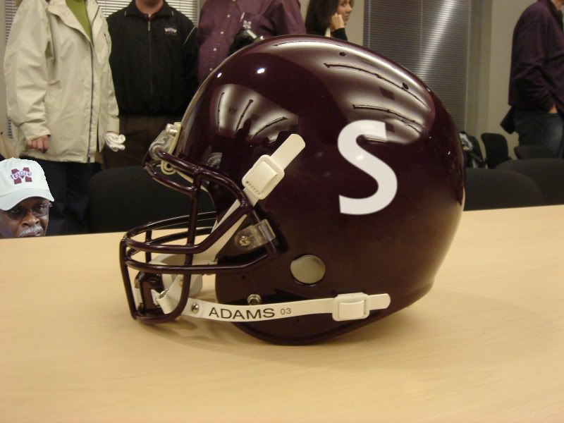
Before we put the logo debate to rest....
- Thread starter NutherT
- Start date
You are using an out of date browser. It may not display this or other websites correctly.
You should upgrade or use an alternative browser.
You should upgrade or use an alternative browser.


B
BullDawg62
Guest


I think is a little hard on the eyes but I also think it shows more originality than anything else given to the university in the recent group of logos.
There was a picture of Jackie standing next to an S on one of the portals at the stadium and I thought that it would look good on the helmets. Someone said that it would be too close to meaning SWAC, but I don't see why. S for State. I think it looks badass.
Latest
-
01
 Maroon and White
Thomas Bassong's potential excites Mississippi State HC Chris Jans
Maroon and White
Thomas Bassong's potential excites Mississippi State HC Chris Jans
-
02
 Maroon and White Football
Former Mississippi State HC Jackie Sherrill given 2027 Paul "Bear" Bryant Lifetime Achievement Award
Maroon and White Football
Former Mississippi State HC Jackie Sherrill given 2027 Paul "Bear" Bryant Lifetime Achievement Award
-
03
 Maroon and White
Mississippi State Week 7 Preview: Oklahoma Players to Know
Maroon and White
Mississippi State Week 7 Preview: Oklahoma Players to Know
-
04
 Maroon and White Basketball
Chris Jans gives Josh Hubbard injury update
Maroon and White Basketball
Chris Jans gives Josh Hubbard injury update
-
05
 Maroon and White
"We gotta tackle better": Mississippi State CB Jett Jefferson diagnoses Week 7 struggles
Maroon and White
"We gotta tackle better": Mississippi State CB Jett Jefferson diagnoses Week 7 struggles