2015 Football Uni's
- Thread starter ChillbillyRock
- Start date
You are using an out of date browser. It may not display this or other websites correctly.
You should upgrade or use an alternative browser.
You should upgrade or use an alternative browser.


Dear Sweet Baby Tiny Jesus, please let these be the pants we wear. That side thigh logo looked turrible last year.


Oh, no! The maroon socks will overheat our players!**
Those look terrific.
Thanks fellers. Im real pleased with what the Ath Dept has done in recent years in terms of Effort and putting an emphasis on what we look like (in all sports). But for some reason, I'm like, "We're almost there". Maybe its my AD in HD. It's literally the minor details that make a difference. Such as making details visible from afar (Names on back in maroon then outlined/shadowed in black). The names/numbers on the back of my concepts are the same, just done where u can read them easier. Another thing that is real pleasing to the eye (atleast my eye) is the facemask and pants being the same color. And if we must use the pants we wore last yr with the large/tilted Mst on the leg, I think it should've been done in silver instead of maroon (so its not so much "Boom, we're trying real hard to be different" instead of a cool ghostly detail that u notice when your up close). As always, thanks for your feedbacks. Feel free to use that pic, I have no problems with that. Have a great long Easter Weekend.
Latest
-
01
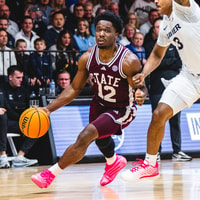 Maroon and White Basketball
Xavier 81-63 Mississippi State: Distance shooting hurts Bulldogs in Greenbrier defeat
-
02
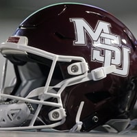 Maroon and White Football
Kickoff Time Change: Mississippi State vs. Auburn
-
03
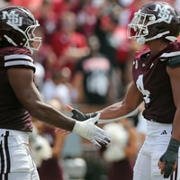 Maroon and White Football
Mississippi State Keys to Victory vs. Auburn
-
04
 Rivals Basketball Recruiting
4-star center Chris Brown commits to Mississippi State
-
05
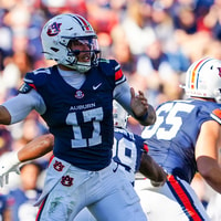 Maroon and White Football
Mississippi State Week 11 Preview: Auburn Q and A