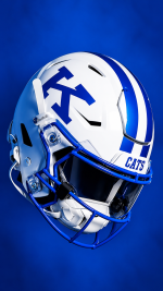
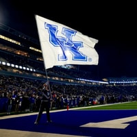
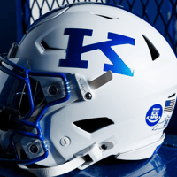
NEW Power K uniforms

Ash Williams

Heisman
Aug 3, 2022
8,550
26,929
113
Just play winning football. Who worries so much about helmets, shoes, jerseys?
John Wooden's first day of practice he sat the players down and taught them how to put on their socks the exact same way. So they wouldn't get blisters. Uniforms are important. Learn.
 

RunninRichie

Heisman
Sep 5, 2019
29,441
71,010
113
Damn, I'm agreeing with Richie.:p
 
  • Haha
Reactions: davtay

UKGrad24

All-American
Apr 2, 2024
3,078
7,708
100
Get rid of the birds logo, the black uniforms, the chrome helmets, and just keep these and that field. It's pretty simple.
Why the F do they complicate this. These are the best looking uniforms in the conference. Just f'n use them and end the madness. This is it, it's done. Wear them and leave it the f alone. And anyone who doesn't like these there's nothing that can be said. You're clueless and I've said for years the Kentucky across the chest is bad. Numbers only. This uniform might be the best uniform in football. It's an A+ on all levels.
 

Ukbrassowtipin

Heisman
Aug 12, 2011
82,312
90,297
113
Love these. Bought a few hats and shirts already. Ive also been buying a lot of gear lately with the really the old school looking wildcat from the 70s era.1000013119.jpg

I refuse to buy or wear anything with that bird looking logo
 
  • Like
Reactions: RunninRichie

VC99

Senior
Sep 16, 2025
282
657
93
Why the F do they complicate this. These are the best looking uniforms in the conference. Just f'n use them and end the madness. This is it, it's done. Wear them and leave it the f alone. And anyone who doesn't like these there's nothing that can be said. You're clueless and I've said for years the Kentucky across the chest is bad. Numbers only. This uniform might be the best uniform in football. It's an A+ on all levels.
We finally have uniforms that makes us at least look like we'd be good at football. Again, Barnartt's incompetence had touched every part of this athletic department, down to the logos and horrid football jerseys.
 

dckala2_

Senior
Jan 12, 2016
298
585
93
I really like the C A T S on the shoulder sleeves, beats the hell out of the checkers.

My only concern with the power K is outside of the state no one knows what it stands for. Had one on my car as a freshman and when back home people thought it was for Kansas or some ish lol.
 
Jul 6, 2025
2,750
7,422
113
The checkerboard, birds, highschool looking uniforms to the power K ones literally embody the Mitch Barnhartt tenure and his utter incompetence.

Imo the worst part of the interlocking letters ans the birds ever been allowed as our logos is the fact two other teams have the EXACT same design. UH has the exact same interlock and kstate has the birds.

How on earth did we ever agree to not one but two logos that were not exclusives. Just egregious.
 

RunninRichie

Heisman
Sep 5, 2019
29,441
71,010
113
Imo the worst part of the interlocking letters ans the birds ever been allowed as our logos is the fact two other teams have the EXACT same design. UH has the exact same interlock and kstate has the birds.

How on earth did we ever agree to not one but two logos that were not exclusives. Just egregious.
Mitch Barnhart.
 

BigBluefoot

All-American
Jul 4, 2025
2,146
7,528
113
If I never see a damn blue checker in my life, I will be happy. I don't think I met anyone who liked them, yet there they were every year.
Now the chrome helmets I kind of like. Wouldn't mind seeing the power K on a blue tint chrome helmet or a blue power K on those all white flat matte helmets we had a few years back. Really like this uniform. Clean and classic.
 

coalBucket

All-Conference
Sep 27, 2008
488
1,016
88
Need a power K wallpaper for my iPhone. Come on you creative folks make one up. 😃
Here’s some AI slop that might suffice.
 

Attachments

  • 9D539A2A-0188-4FA8-81B9-31FB80A3EDA2.png
    9D539A2A-0188-4FA8-81B9-31FB80A3EDA2.png
    1.7 MB · Views: 2
  • 24B9F488-3631-4CAF-8ED6-66877FCC9BFB.png
    24B9F488-3631-4CAF-8ED6-66877FCC9BFB.png
    1.3 MB · Views: 2
  • 62562A61-FA9C-472E-88A2-522FCC3BA1A4.png
    62562A61-FA9C-472E-88A2-522FCC3BA1A4.png
    965 KB · Views: 2

L.O.D.

All-Conference
Feb 4, 2024
1,330
1,716
77
Remember when Pitino would change uniforms it seemed every season - sometimes twice in a season ( denim year) . The helmet i think had a single K on it when I went to UK in the 90s I like it better than tbe UK ... but it far less important thsn winning.
 

UKGrad24

All-American
Apr 2, 2024
3,078
7,708
100
Remember when Pitino would change uniforms it seemed every season - sometimes twice in a season ( denim year) . The helmet i think had a single K on it when I went to UK in the 90s I like it better than tbe UK ... but it far less important thsn winning.
Quick question what does this mean? Are they normally exclusive. I see this said all of the time. I want us to be branded well and look good win or lose. Why wouldn’t we? This is how sports work, looking good is looking good, it’s what teams do lol.

“here ya go Will sign whichever you want.”

Is this how some people see this?
  • Look like sht but win
  • look awesome and lose
  • What the living fck? ?
 

davtay

All-Conference
Dec 31, 2002
1,334
1,378
113
Quick question what does this mean? Are they normally exclusive. I see this said all of the time. I want us to be branded well and look good win or lose. Why wouldn’t we? This is how sports work, looking good is looking good, it’s what teams do lol.

“here ya go Will sign whichever you want.”

Is this how some people see this?
  • Look like sht but win
  • look awesome and lose
  • What the living fck? ?
Calm down mourg. Some teams do look like crap. One that gets raved on by a bunch in here is Oregon. They have dozens of unis and helmets and 95% of them look like crap.

Imo, the checkerboard, chrome helmets, grey unis and all blue unis and helmets look like crap. Evidently somebody likes them.

It factors in about <1% on the won loss record.

It is just opinions and nothing more.
 
  • Like
Reactions: The Nightman2

UKGrad24

All-American
Apr 2, 2024
3,078
7,708
100
Calm down mourg. Some teams do look like crap. One that gets raved on by a bunch in here is Oregon. They have dozens of unis and helmets and 95% of them look like crap.

Imo, the checkerboard, chrome helmets, grey unis and all blue unis and helmets look like crap. Evidently somebody likes them.

It factors in about <1% on the won loss record.

It is just opinions and nothing more.
No that's the point. Really no one liked them. Barnhart was blasted about those combos. He even threw it on the players then they posted they hate them too lol. Start a poll and you'll quickly see the percentage of people that likes those for a full on branding is nearly 0. I live in Lex and was on campus for grad during a few of those years. Everyone hated them that I saw. I talk to fans all over I don't think I've heard one person who liked them in all these years. Not saying they're not around but it's so small they don't even hold a legitimate minority. Barnhart wanted that done and signed off and he wasn't going to change anything come hell or high water. Guy had it out for the base for a lot of years after the Tubby / Gillispie fiasco. That was one grudge he was holding. Notice it's dying and fans are given more now that he's exited. It's not a coincidence.

On the Oregon comments, they are some of the most popular combos there are. Checkerboards look like ****, they have some that aren't good some that are awesome and it fits what they do. They're usually top 3 in merchandise sales especislly outside of Blue bloods who sell based on fanbase volume. They are absolutely a top 10 for jersey sales by aggregate. They're a huge brand, so you might not like it but they're probably the single most popular brand outside of Blue bloods who like I said are just about fanbase size, not buying based on jersey popularity. Texas could wear pink jerseys with hearts and Texas fans will keep them top 10. Oregon checks all those boxes, people want to buy them in any case.

I love these power K, to me that's one of the best looks in football and absolutely the best in the SEC to me.

As for opinions, I wasn't asking an opinion. I was asking why some people act like looking good means you lose and looking bad means a win. It's bizarre that it's said as much as it is. Georgia looks good and wins. So does Texas. So does others. Why even bring that up? I was asking a question. Not sure why your branding has anything to do with field play. Look good because that's obvious. Win too, obvious.
 
  • Like
Reactions: RunninRichie

RunninRichie

Heisman
Sep 5, 2019
29,441
71,010
113
No that's the point. Really no one liked them. Barnhart was blasted about those combos. He even threw it on the players then they posted they hate them too lol. Start a poll and you'll quickly see the percentage of people that likes those for a full on branding is nearly 0. I live in Lex and was on campus for grad during a few of those years. Everyone hated them that I saw. I talk to fans all over I don't think I've heard one person who liked them in all these years. Not saying they're not around but it's so small they don't even hold a legitimate minority. Barnhart wanted that done and signed off and he wasn't going to change anything come hell or high water. Guy had it out for the base for a lot of years after the Tubby / Gillispie fiasco. That was one grudge he was holding. Notice it's dying and fans are given more now that he's exited. It's not a coincidence.

On the Oregon comments, they are some of the most popular combos there are. Checkerboards look like ****, they have some that aren't good some that are awesome and it fits what they do. They're usually top 3 in merchandise sales especislly outside of Blue bloods who sell based on fanbase volume. They are absolutely a top 10 for jersey sales by aggregate. They're a huge brand, so you might not like it but they're probably the single most popular brand outside of Blue bloods who like I said are just about fanbase size, not buying based on jersey popularity. Texas could wear pink jerseys with hearts and Texas fans will keep them top 10. Oregon checks all those boxes, people want to buy them in any case.

I love these power K, to me that's one of the best looks in football and absolutely the best in the SEC to me.

As for opinions, I wasn't asking an opinion. I was asking why some people act like looking good means you lose and looking bad means a win. It's bizarre that it's said as much as it is. Georgia looks good and wins. So does Texas. So does others. Why even bring that up? I was asking a question. Not sure why your branding has anything to do with field play. Look good because that's obvious. Win too, obvious.
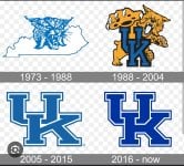
Can we get the old UK logo, with the power K, for basketball? This is the UK basketball logo.
 
KSR

Latest

  1. 01 KSR Football KSR Staff Predictions: Kentucky vs. No. 10 LSU
  2. 02 KSR Football Recruiting Recruiting Rundown: Best Kentucky Football Guest List Ever?
  3. 03 KSR Basketball Recruiting 7-5 center Cherif Millogo arrives for surprise official visit to Kentucky
  4. 04 KSR Basketball What ESPN is saying about Kentucky MBB ahead of the 2026-27 season
  5. 05 KSR Volleyball No. 4 Kentucky VB back on track with LSU sweep