
Full view of field.
- Thread starter DesotoCountyDawg
- Start date
You are using an out of date browser. It may not display this or other websites correctly.
You should upgrade or use an alternative browser.
You should upgrade or use an alternative browser.
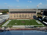


Looks like a USC game at halftime


Even without the paint, there ain't a better looking football field in America. It is always so pristine and flawless for the first game, that it almost look like artificial turf.

Somebody call a pressure washer for that east side
Damn.. I just got my erection under control from the first four notes thread…
I think they paint the end zones maroon once SEC play starts9/10...Endzones should be maroon.


No.May I use this on my Facebook for my cover image?
Use a banner M stock photo.
I’m so happy the field painter knew how to spell Missippi!

ESPN will never know which logo to use for us now.

Question: would a wider font for Bulldogs look better or worse to fill up more space? Lack of balance is noticeable and probably annoying to someone with at least a touch of the 'tism (@Maroon Eagle)
No, I'm not bitching. I have a half chub from the midfield logo already.
No, I'm not bitching. I have a half chub from the midfield logo already.

You’re right that the lack of balance is a bit annoying to me.Question: would a wider font for Bulldogs look better or worse to fill up more space? Lack of balance is noticeable and probably annoying to someone with at least a touch of the 'tism (@Maroon Eagle)
I’d go with HAIL STATE in place of MISSISSIPPI STATE and make the fonts wider for both end zones. It’s pretty scrunched up as it is right now…
My man. We're on the same page here.You’re right that the lack of balance is a bit annoying to me.
I’d go with HAIL STATE in place of MISSISSIPPI STATE and make the fonts wider for both end zones. It’s pretty scrunched up as it is right now…
@Maroon Eagle and @ckDOG hate Sydney’s pointy elbows.

From what I’ve seen, they’re still not sung &tate. Usually takes them a year or 2 to catch up.ESPN will never know which logo to use for us now.

We should be proactive and just sent them the one we want them to use It can't be that hard. Image & branding matter.ESPN will never know which logo to use for us now.



Sixpackspeak. Don’t you see the S in State, the P in Mississippi, and the other S in Bulldogs? The imagery is everywhere if you look.Do we not have an on field sponsor lined up?

Do we not have an on field sponsor lined up?
I honestly was expecting a field and/or uniform sponsorship before the first game. I’m torn about it. For the right price, the tackiness would be worth it.
Looks good.
Do we have a field sponsor? Don't see one.
The east side really does need pressure washing. You can still tell there's a difference in the lower level and the upper level, and it's been there almost 25 years and still hasn't become the same color.
Latest
-
01
 Maroon and White
Mississippi State Bye Week Checklist: What Needs Work?
Maroon and White
Mississippi State Bye Week Checklist: What Needs Work?
-
02
 Maroon and White Football
Mississippi State Bye Week Watchlist
Maroon and White Football
Mississippi State Bye Week Watchlist
-
03
 Maroon and White
Mississippi State Basketball tipoff times finalized
Maroon and White
Mississippi State Basketball tipoff times finalized
-
04
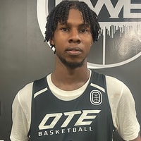 Rivals Basketball Recruiting
Mississippi State, Maryland & UCF talking visits with 4-star forward K'Nard Callendar
Rivals Basketball Recruiting
Mississippi State, Maryland & UCF talking visits with 4-star forward K'Nard Callendar
-
05
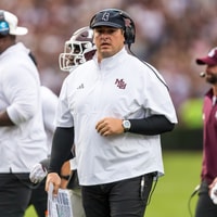 Maroon and White Football
"Fine line": Mississippi State HC Jeff Lebby speaks on managing health and preparation
Maroon and White Football
"Fine line": Mississippi State HC Jeff Lebby speaks on managing health and preparation