
And they have won the MSU crown from the media.Only other team I’ve been around that calls themselves State is Michigan State.
And they have won the MSU crown from the media.Only other team I’ve been around that calls themselves State is Michigan State.


I would agree that State can have a unique helmet logo and still use the MState as the university logo. I don't have a problem with that. HOWEVER...
You give an inch, they want a mile .... with state fans. I've seen state people seriously discussing taking every MState logo off the football stadium. I've seen State fans lose it over the MState logo being a tv graphic for a baseball game. When we did the throw back uniforms for the 1996 basketball team, the school purposely left off the MState logo. Which 1996 was the first year we wore the logo on a uniform. I mean..... wtf? Why do some have such a hate for the logo. It's really odd and weird but sooooo, Mississippi State fan.
This is what I meant earlier about the bubble. Many people in Starkville and around MS don't want to see outside of it. Just argue and change based on what the loudest want, others just go along with it, and we never have had the tough leadership needed to stand up to it, and to stay long enough to ensure it is cemented.Nobody can shoot themself in the foot better than Mississippi State. Not just the logo. In just about every way you could imagine.
Hey man, don't you know, we just need a win a little ********I don’t mind the State monicker. We own it in the South. Having the baseball jersey font with the tail as our main logo is stupid and should be corrected.
I’m a big college football fan. I can go 138 for 138 on D1 football logos and go 80 percent plus on D2 and D3. No one has a worse logo for standing out in D1. No one.

Don’t be so toxic**As much as I love a good logo fight, our logo is so 17’n far away from being the problem with our football team
f you're going to consider the original banner M-State as being the same category as the modern M-State logo, then you have to consider the MSJ logo as being the same as the interlocking logo. I have never like the M-State logos on hats or shirts, and for sure not on the helmets, that me. I have always thought the interlocking logos looked better on clothes, helmet, and 50 yard line. And yes, MS on baseball always.The logos from 1974-2000 are all pretty much just slight variations of the same basic logo.

I bet when UF fans hear State, they think of FSU.Everyone in the SEC refers to us as State. It is our brand

Our logo is unrecognizable.
Actually they say FSU. So do Florida State fans themselves. My uncle was an FSU grad.I bet when UF fans hear State, they think of FSU.
Its more like, "A Fay Shoe"Actually they say FSU. So do Florida State fans themselves. My uncle was an FSU grad.
This logo (1974 - 1978)The logos from 1974-2000 are all pretty much just slight variations of the same basic logo.
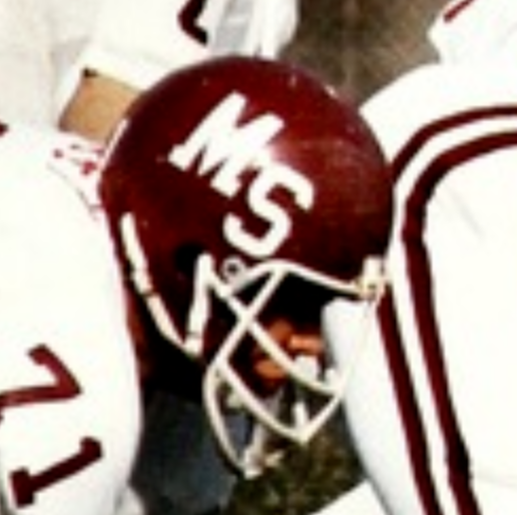
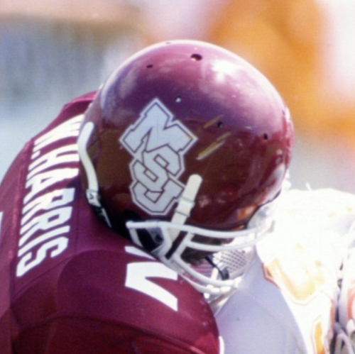

One of his best sayings is “you don’t even need a number on the side of your car. If you win, they’ll know who you are.

 Exhibit A:
And if you go anywhere then it's just like the "state" logo. That's why I stopped buying it. If you get out of the south I was always asked is that ... state. No it was Mississippi State.I absolutely hate the banner M. I won't wear or buy anything with it. I graduated in 2010, but started watching and became a fan in 1999. I associate it with Croom, Russell athletics, and Larry Templeton. I hope they erase it from history.
They’re both diagonally cascading initials. All they did was add the U. Pretty minor change.This logo (1974 - 1978)
Is not the same as THIS logo (1986-1990)
I will grant you the Bellard and Sherril era logos are very similar in font, but the Bellard era logo did not interlock. The Sherril logo is like the Bellard and Felker logos had a baby.

This.Walking Bully and interlocking MSU should be State’s branding for football, and I’ll fist fight anyone who says otherwise. Iconic.
1,000,000,000 % YESI
f you're going to consider the original banner M-State as being the same category as the modern M-State logo, then you have to consider the MSJ logo as being the same as the interlocking logo. I have never like the M-State logos on hats or shirts, and for sure not on the helmets, that me. I have always thought the interlocking logos looked better on clothes, helmet, and 50 yard line. And yes, MS on baseball always.

That is correct. My FSU friends refer to us as State sometimes.Actually they say FSU. So do Florida State fans themselves. My uncle was an FSU grad.
Adding the U is enough to change the look and feel. The Felker logo changes the font, interlocks the letters, and adds a shadow background. There are similarities, but the differences overwhelm them from a logo perspective.They’re both diagonally cascading initials. All they did was add the U. Pretty minor change.
 Maroon and White
Results-focused Arnett and Brock back with Mississippi State defense
Maroon and White
Results-focused Arnett and Brock back with Mississippi State defense
 Maroon and White
Everything Mississippi State DC Zach Arnett said at his media availability on Monday
Maroon and White
Everything Mississippi State DC Zach Arnett said at his media availability on Monday
 Maroon and White
Mississippi State 2026 Projected Depth Charts: Cornerback
Maroon and White
Mississippi State 2026 Projected Depth Charts: Cornerback
 Maroon and White
"Run Hard, Work Hard, Press Hard": O'Brien's Style setting in with Mississippi State Soccer
Maroon and White
"Run Hard, Work Hard, Press Hard": O'Brien's Style setting in with Mississippi State Soccer
 Maroon and White
FAU hiring Mississippi State Deputy AD Josh McCowan
Maroon and White
FAU hiring Mississippi State Deputy AD Josh McCowan
