Fixing the Garden State Hardwood trophy

Upstream

Heisman
Jul 31, 2001
35,286
10,254
113
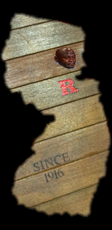
In the pictures and videos from Saturday's game, I notice that the Seton Hall logo tends to pop from the Garden State Hardwood trophy, while the Rutgers logo blends into the reddish brown background.

While Rutgers has the trophy in our possession, I think they should outline the block R in white, to make it stand out a little better.


Sir ScarletKnight

All-Conference
Jan 17, 2015
1,809
1,513
0
It's been touched up each year by the team that wins it. Also, I think a lot of it not showing up well in that picture is the lighting.


  • Like
Reactions: kcg88

RUsojo

Heisman
Dec 17, 2010
30,012
29,393
113
Brought this up last week.

Options:

1. white outline around the R
2. Lighten the color of the wood
3. Repaint brighter and frequently

RU AD should be on this it’s been a multi year problem.
 
  • Like
Reactions: ScarletDave

kcg88

Heisman
Aug 11, 2017
10,862
17,230
0
Looks a lot better than it did at the beginning, and WAY better than when the Pirate was spruced-up but the R wasn't. A splash of white wouldn't hurt though.
 
  • Like
Reactions: ScarletDave

ScarletKid2008

Heisman
Sep 8, 2006
8,086
10,647
113
agree. I think a white outline around the R is a simple fix.

I've been noticing it in quite a few uses of the block R where black outline has been used where the white would be far more appropriate and visually appealing / make it pop.

These are small, nit-pick type things but these details matter. You want your brand/logo to stand out and look sharp in all cases.
 

RUSK97

All-American
Dec 28, 2007
10,460
6,551
0
The wood is from the Asbury Park boardwalk. I like it as the classic boardwalk color.
Ahh...IIRC tropical hardwood, likely ipe. Cool, but would’ve been even better had it been made with recycled court flooring from the RAC and Walsh Gym. Would’ve been lighter too!
 

ScarletDave

Heisman
Oct 7, 2010
34,726
15,624
85
I just wish the R was our ACTUAL athletic department “R” and not the one from Wikipedia which is totally wrong and made in Paint .. the black outline is broken in the top left (hate when recruits use this R) AND the round part is too short.
Real R:


Fake R and one on the trophy:
 
The Knight Report

Latest

  1. 01 The Knight Report Rutgers Basketball Practice Notebook: Pre-preseason takeaways
  2. 02 The Knight Report Join The Knight Report TODAY and get it for 60% off!
  3. 03 The Knight Report How former Rutgers Football players performed in the NFL's Week Four
  4. 04 The Knight Report Football ESPN FPI projects Rutgers Football's 2026 schedule - Week Six
  5. 05 The Knight Report Rutgers Football versus Maryland Game Time Announced