Is a new era upon us?

OutaStatePlates

Redshirt
Oct 15, 2012
77
0
0
View attachment 9103

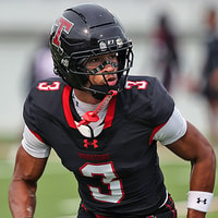
Historically, the introduction of a new football coach brings a change to the helmet logo. Sometimes, its a modernizing & refreshing of the existing design. Other times, its a full-on new logo.

Are we satisfied with continuing the existing design, or would you prefer to use this coaching change as chance to introduce a new look?
 

dickiedawg

All-Conference
Feb 22, 2008
4,583
1,523
113
Keep it. Typically a new coach has come after a period of crappy football, not memories we want to cling to. This is different. We don’t need a shake up to announce that we’re not the same program- it’s time to build on our success and move even higher.
 

WilCoDawg

All-Conference
Sep 6, 2012
5,264
3,654
113
Personally I wish we would stick with something but me thinks it’s too late for that. We’ve switched so much that no one really knows what logo we’ll dance out with. I wouldn’t be surprised if we changed to a MS over a ST in a block formation.
 

512taylor

Redshirt
Sep 2, 2012
1,546
0
0
My gut sure likes the "Felker" helmet, but we need to establish and maintain some tradition, so keep what we have.
 

shotgunDawg

Redshirt
Nov 13, 2011
2,035
0
0
It has always been a no-brainer for me.

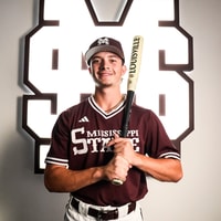
This is our most recognizable & unique logo. Where most people make the biggest mistake when trying to make this helmet is that they make the MS way to big. The MS has to fit nicely on the helmet like the Nebraska "N"

I have no clue why we don't use this helmet design. It's uniquely ours & a real logo. The band could even make it on the field.

Why not? If MSU wants to create more brand awareness nationally, this is the correct logo & it's not close.

View attachment 9104
View attachment 9105
 
Last edited:

was21

Senior
May 29, 2007
10,007
636
113
That's the one but some reason it never gains any traction.
 

shotgunDawg

Redshirt
Nov 13, 2011
2,035
0
0
The baseball logo looks too much like MC's football helmets.

Huh?

Who give Sh&* what the MC football helmets look like?

We are trying to build a national brand here. What the MC football helmets look like is irrelevant.

Once we go to the MS logo on the helmets, we will never have to change helmets again because that is OUR logo. That is the classic, perfect MSU logo that we have for some reason been unable to find for 100 years.

Creating MSU's football helmet logo is the easiest job in the world that somehow we have made extremely difficult. It absolutely ridiculous.

And for those that want to protect it as the baseball logo. Eat a Di*&

We are trying to build a national brand & you cannot do that with a banner M-State logo. You have to have a logo that someone would find attractive to wear on a hat or on a shirt. Baseball isn't big enough to develop the brand & thus the MS logo has to go on the football helmet. I've been absolutely mind boggled my entire life that we have made this so difficult
 

philduckworth

Redshirt
Feb 20, 2015
2,228
0
0
I love leaving the M over S to just baseball. I would love to see football go back to a modern MSU interlocking, but it probably won't happen.
 

thf24

Redshirt
Jan 28, 2011
1,334
3
38
I like that logo as much as the next guy, but there's something dated about it in my opinion; like it belongs in the late 80's/early 90's. Works with baseball, doesn't seem natural to me for anything else.

Also, the band probably couldn't make it easily recognizable. Too much going on in too small a space for the scale they're working with.
 

skydawg1

All-Conference
Jul 31, 2007
5,611
2,015
113
I love leaving the M over S to just baseball. I would love to see football go back to a modern MSU interlocking, but it probably won't happen.
The M over S is strictly for baseball.

It looks like crap on the side of a helmet.
 

philduckworth

Redshirt
Feb 20, 2015
2,228
0
0
We let Larry Templeton and the consulting firm he hired ruin our helmet logo. We can still keep the Mstate as our program logo, but I wish Cohen would look at some new designs for the helmet.
 
Last edited:

VegasDawg13

Freshman
Jun 11, 2007
2,191
80
48
I would be fine with the baseball logo for everything, but I disagree that it's the most recognizable (unless you mean that differently than I'm taking it; maybe you're saying it's more recognizably "ours").

Nationally-speaking, hardly anyone watches college baseball, and even those that do watch some, it's not like we're mainstays in Omaha. We've won a lot of football games and were ranked #1 in the nation with the Banner M-State 2.0. It has to be our most recognized logo. That this era of unprecedented success happened to overlap with the explosion in number of televised games adds to it as well.
 

josebrown

All-Conference
Aug 4, 2008
3,240
1,382
113
It has always been a no-brainer for me.

This is our most recognizable & unique logo. Where most people make the biggest mistake when trying to make this helmet is that they make the MS way to big. The MS has to fit nicely on the helmet like the Nebraska "N"

I have no clue why we don't use this helmet design. It's uniquely ours & a real logo. The band could even make it on the field.

Why not? If MSU wants to create more brand awareness nationally, this is the correct logo & it's not close.

View attachment 9104
View attachment 9105

Ive always wanted to use the baseball cap looking football helmet. If we can’t use the interlocking MSU, then it’s a no-brained to me. I’ve never liked the logo we have now, but that’s just me. Even though I used it for a baseball team for a while, I don’t like it. As exciting and known our baseball logo is it should be used across the board, but that would be too easy, I guess.

i really wouldn’t mind us using logo on one side and nothing or number on the other side. I’m just ready for the banner to go. It still reminds me of Croom years and reminds me of white helmets too for some reason.
 
Last edited:

shotgunDawg

Redshirt
Nov 13, 2011
2,035
0
0
The M over S is strictly for baseball.

It looks like crap on the side of a helmet.

I just don’t agree with this & see protecting the school’s best logo for just baseball as extremely small thinking without regard for the bigger picture.
 

shotgunDawg

Redshirt
Nov 13, 2011
2,035
0
0
I like that logo as much as the next guy, but there's something dated about it in my opinion; like it belongs in the late 80's/early 90's. Works with baseball, doesn't seem natural to me for anything else.
.

I don’t agree.

Texas A&M uses a lett logo. Oklahoma has the same logo but with an OU, Arizona State used the interlocking AS at one point, Auburn uses a similar logo with the AU.

I think it’s a beautiful, concise logo that would be immediatly recognizable.

I just don’t see how people don’t want to use that logo.
 

Baddmann

Freshman
Sep 20, 2015
431
66
28
I like the current setup. We need to keep what we have. That is the only way to continue building the brand.
 

MagicDawg

Senior
Nov 11, 2010
1,001
975
113
I hate the Croom M-ruffle - too much detail for good reproduction, embroidery, graphics, etc. I like the current M-State version and I don't see any reason to change it. Clean and crisp and usable in all kinds of circumstances.My opinion - we need to get over the MSU logos. They were great in the day, but it's wasted effort to pine over them. It's time to move this train down the track. If we are going to build the brand, it needs to be more on Mississippi State and less on MSU.
 

MSUDawgFan86

Redshirt
Aug 14, 2017
1,331
1
0
It has always been a no-brainer for me.

This is our most recognizable & unique logo. Where most people make the biggest mistake when trying to make this helmet is that they make the MS way to big. The MS has to fit nicely on the helmet like the Nebraska "N"

I have no clue why we don't use this helmet design. It's uniquely ours & a real logo. The band could even make it on the field.

Why not? If MSU wants to create more brand awareness nationally, this is the correct logo & it's not close.

View attachment 9104
View attachment 9105

Man it’s a baseball only logo. It doesn’t work on a football helmet. That looks like a cost saving measure a bad 1A high school football team helmet that can’t afford equipment would use.
 

hailstate19

Redshirt
Nov 7, 2015
1,190
41
48
I hate the banner logo (especially the current one)

I would love for football to go back to the interlocking msu. That's clearly the best logo. Then we should keep it and never change it agian
 

kb549

Sophomore
Oct 6, 2014
835
141
43
I would love to see us own “STATE” like Miami did with The U. It may be unpopular, but I kinda like this. One of my favorite shirts was a dark gray shirt with white lettering across the chest in this type font.

<a href="https://ibb.co/c0akjb"><img src="https://preview.ibb.co/bUiucw/D7772_C50_F7_B6_4921_9601_3_C69_DE2_D4624.jpg" alt="D7772_C50_F7_B6_4921_9601_3_C69_DE2_D4624" border="0"></a><br /><a target='_blank' href='https://imgbb.com/'>bb img</a><br />
 

Dawgs87

Freshman
Nov 27, 2017
67
50
18
The M over S is strictly for baseball.

It looks like crap on the side of a helmet.


I would have to respectfully agree with you, sir. Something about it just looks weird to me. But, then again, I've always been partial to the Sherrill helmets.
 

archdog

Redshirt
Aug 22, 2012
1,882
0
0
Let the M be formed out of band members in uniform, the S formed out of band members wearing poorly fitting t-shirts and shorts.
 

patdog

Heisman
May 28, 2007
60,542
31,800
113
We're not changing the logo. We've spent a lot of time and money on it, and it's the logo we're recognized for. It's going to be here for a long time. We need to keep the uniforms exactly the same as they are now.
 

MeridianDog

Freshman
Sep 3, 2008
3,226
80
48
Obviously I like the Block M STATE.


<<<<<<<<<


Keep it. Make it be our thing.
 
Last edited:
Oct 31, 2006
181
0
16
I know I’m in a minority of one, but I’ve always been partial to the flying M. Wish we could at least break it out occasionally. (It always reminds me of the cheese. Mmmmm. Cheese).
 

MaroonNation

Redshirt
Jun 9, 2015
3,729
0
0
I saw where Florida will be going to the Jordan brand of unies next year. He was pumping some Air Jordan’s on his recuiting visit to the 5’9” 2* WR today.
 

The Peeper

Heisman
Feb 26, 2008
16,725
12,488
113
I think "M State" in any shape, form, fashion, or color sucks sweaty Bully balls no matter how much was spent on "branding" it. After that I really don't care, I just wish they would get something to stick with and quit tinkering with it and tell Adidas no more gimmicky crap. I kind of thought Cohen's may lean toward the baseball logo eventually
 
Maroon and White

Latest

  1. 01 Maroon and White Baseball "This is Home": 2028 OF Axton Westmoreland commits to Mississippi State
  2. 02 Maroon and White Basketball Mississippi State MBK Assistants speak on size and length added to 26-27 squad
  3. 03 Maroon and White Football "Go make the play": Mississippi State HC Jeff Lebby on Defense and responding to Alabama game
  4. 04 Maroon and White Basketball Mississippi State WBK to play exhibition at Choctaw Central HS
  5. 05 Rivals Football Recruiting WR Darion Moseley backs off pledge to Arkansas, has Big Ten and SEC schools on his list