
Pretty interesting adjustments to several schools’ logos. Ours is first. https://www.goodbullhunting.com/202...ootball-logos-photoshop-graphic-design-sports
""STATE" feels like it's falling to the left". Does it ever, brother. ***Pretty interesting adjustments to several schools’ logos. Ours is first. https://www.goodbullhunting.com/202...ootball-logos-photoshop-graphic-design-sports

""STATE" feels like it's falling to the left". Does it ever, brother. ***


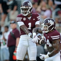 Maroon and White
Injury Report: KaMario Taylor and Fluff Bothwell remain questionable
Maroon and White
Injury Report: KaMario Taylor and Fluff Bothwell remain questionable
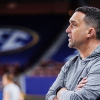 Maroon and White Basketball
Culture and Retention sets the stage for Year 5 under Sam Purcell
Maroon and White Basketball
Culture and Retention sets the stage for Year 5 under Sam Purcell
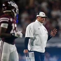 Maroon and White Football
Keys to Victory for Mississippi State at LSU
Maroon and White Football
Keys to Victory for Mississippi State at LSU
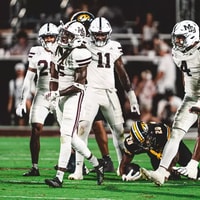 Maroon and White Football
Mississippi State Week 7 Preview: Who carries the load?
Maroon and White Football
Mississippi State Week 7 Preview: Who carries the load?
 Maroon and White Basketball
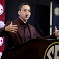
Everything Mississippi State WBK HC Sam Purcell said at SEC Media Days
Maroon and White Basketball
Everything Mississippi State WBK HC Sam Purcell said at SEC Media Days


