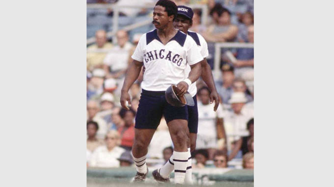
I think we can all agree that our dogs have the best caps in the game. Classic. Never changes or looks dated. I also love Miami's script M caps and Arizona State's and Oregon State's
But what are the worst caps in the college game?
For me the ugliest are TCU (hate the big block TCU across the front) East Carolina (same reason as TCU except much uglier) Penn State's block S and OM's Sunday red caps that look enormous
Am I missing any?
But what are the worst caps in the college game?
For me the ugliest are TCU (hate the big block TCU across the front) East Carolina (same reason as TCU except much uglier) Penn State's block S and OM's Sunday red caps that look enormous
Am I missing any?