Chillbilly Concepts Summer Edition Vol 1
- Thread starter ChillbillyRock
- Start date
You are using an out of date browser. It may not display this or other websites correctly.
You should upgrade or use an alternative browser.
You should upgrade or use an alternative browser.


So frustrating viewing this...
Why we don't adopt some of your ideas in lieu of what we have now is beyond me. Great, great stuff. I just wish our Athletic department would take more of your ideas.
Maybe they are and I spoke to soon. I sure hope so.
Why we don't adopt some of your ideas in lieu of what we have now is beyond me. Great, great stuff. I just wish our Athletic department would take more of your ideas.
Maybe they are and I spoke to soon. I sure hope so.
Whatever happens we don't need the stripe running down the middle of the helmet, and we don't need the ugly stripes on the shoulders.
Interlocking MSU is classic & classy. However, I'd suggest the early 80's one that didn't connect the M directly with the U. That way, you almost assuredly get around any Nike copyright. I've always felt the early 80's was the best anyway, with the clean, simple maroon helmet with plain white interlocking MSU.
Of the ones you;ve posted, I also like the throwback MS, with the "M-State" logo in the background. Would think you might also have something with the snarling bulldog as the background on an inter-locking MSU.
Of the ones you;ve posted, I also like the throwback MS, with the "M-State" logo in the background. Would think you might also have something with the snarling bulldog as the background on an inter-locking MSU.


But Stricklin said we had our own Adidas design team!!
Ya'know? The one that came up with the almost identical design to that of Texas A&M.
Ya'know? The one that came up with the almost identical design to that of Texas A&M.
honestly that interlocking MSU logo just doesn't look that great me - although I know a ton of our fans love it. Do you guys really like the way it looks or just that it reminds you of our best days as a program?
Personally i think the baseball logo looks much better on the helmet and is a more potentially recognizable logo.
Personally i think the baseball logo looks much better on the helmet and is a more potentially recognizable logo.
I'm a big fan of the interlocking logo, but some of it might be because it reminds me of the SEC Championship game, etc. Still, I think it's a better logo than the current M-State logo. I, too, like the baseball logo, and think that looks better than the M-State logo as well.
I'm with you on the 'MS' logo. Its an interlocking MS(like the baseball). It also hushes all the Nike nonsense & has another meaning (abbr: MS). Unlike some of you, I like the MState banner logo bc its perfectly balanced & fits anywhere a circle or square can (they may not mean a lot to some, but it helps me out). I also like the MississippiState banner logo bc we needed an athletic/academic wordmark, badly. We now need a "School Initials" & a "Bulldogs" logo.
All I can say is that I agree with many others that your work is strong; you are light years ahead of the university and Adidas. I'm not a big fan of the "M-State" logo and think it is the absolute weakest design of any you've shown us, but I have to respect your professional opinion on the merits of that logo. I think the picture of our landmass with the "State" banner across it would be a cool logo for use on limited edition special uniforms. On a loosely related note, I hope to never see a black Miss State football uniform again. They look turrible to me. A predominantly white uniform pops. Black ... Not at all.

First off, these are awesome, so please don't take my criticism as anything negative. The interlocking MSU is amazing. The only concern I have is the thickness of the lines of the letter. The point in the middle of the M looks awkwardly thin and I would consider beefing the interior lines of the letters up some. Amazing work, though. Our AD should hire you and let you do all of our sports teams' unis.

Great Job, as always, Chillbilly.
I know I'm in the minority around here, but I like the banner M logo that we currently have, better than anything we've had in the past. The banner M logo under Croom was just way too busy with all the curls. While I respect the interlocking MSU and what we accomplished under it (I still have some old hats, clothing, etc with this), it's a little too cumbersome, dangling, and ungainly to me. If we went that route let's drop the U. Our current banner M logo where the banner itself is more implied, is emphatic and straight forward. Not a fan of the "Banner" stripes every where else on the uni though. That seems counter intuitive to "branding" by complicating matters and getting too cute with a theme, like an overzealous preschool teacher's bulletin board about the Alphabet.
The Baseball Logo may be our best, but it should stay on ball caps and not football helmets.
I don't even know what to think of the Landmass logo. It's awkward.
Just my unpopular opinion. I'm not bashing your work Chillbilly, it's outstanding.
I know I'm in the minority around here, but I like the banner M logo that we currently have, better than anything we've had in the past. The banner M logo under Croom was just way too busy with all the curls. While I respect the interlocking MSU and what we accomplished under it (I still have some old hats, clothing, etc with this), it's a little too cumbersome, dangling, and ungainly to me. If we went that route let's drop the U. Our current banner M logo where the banner itself is more implied, is emphatic and straight forward. Not a fan of the "Banner" stripes every where else on the uni though. That seems counter intuitive to "branding" by complicating matters and getting too cute with a theme, like an overzealous preschool teacher's bulletin board about the Alphabet.
The Baseball Logo may be our best, but it should stay on ball caps and not football helmets.
I don't even know what to think of the Landmass logo. It's awkward.
Just my unpopular opinion. I'm not bashing your work Chillbilly, it's outstanding.

Have nothing but Paint to work with, but how's this idea?[URL="http://s952.photobucket.com/user/kellybully/media/mississippistatehelmet_zps0aadfd21.jpg.html"][IMG]http://i952.photobucket.com/albums/ae9/kellybully/mississippistatehelmet_zps0aadfd21.jpg[/URL][/IMG]
that looks good. I have to assume that Nike locked that down so tight from an intellectual property standpoint that we don't even try it.
This^
That interlocking MSU wins going away. Damn good work
[URL="http://s952.photobucket.com/user/kellybully/media/maroonhelmetmaroonmask_zps5df50dc5.jpg.html"][IMG]http://i952.photobucket.com/albums/ae9/kellybully/maroonhelmetmaroonmask_zps5df50dc5.jpg[/URL][/IMG]

Thanks Chill!! I dang sure like that MS in white on the maroon helmet. Like you, I like banner M we use today as well.
ChillbillyRock;899932We now need a "School Initials" & a "Bulldogs" logo.[/QUOTE said:When will you have the first drafts for us to look at?

I still think this is the best helmet and uniform
It's so simple and classic
i forgot how awesome Don Smith and #4 Bruce Plummer were...
http://www.youtube.com/watch?v=6WbTrsTzx2w
It's so simple and classic
i forgot how awesome Don Smith and #4 Bruce Plummer were...
http://www.youtube.com/watch?v=6WbTrsTzx2w
Last edited:
ill just be honest...i love the front, side, and back view "throwback" uniforms you have made and always have....the MS is ok....i dont really like the gray "m-state", i do like the interlocking msu helmet....everything else is meh to me. the fact that adidas centered our "new look" around the "state" banner (the shoulder stripe, pant stripe, and helmet stripe) has really turned me off to the whole banner image and honestly modestly pisses me off as it reminds me of how terrible adidas is.
give me classic unis all day every day. sometimes when you try to hard, everything goes sideways. solid, bold lines in the right places with a good central image get it done every time.
give me classic unis all day every day. sometimes when you try to hard, everything goes sideways. solid, bold lines in the right places with a good central image get it done every time.
Latest
-
01
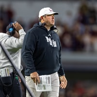 Maroon and White Football
Jeff Lebby fires assistants Phil Loadholt and Cliff Odom after Auburn loss
-
02
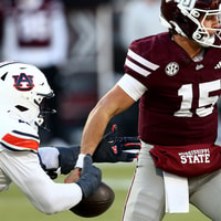 Maroon and White
Mississippi State PFF Grades from 41-9 loss to Auburn
-
03
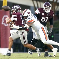 Maroon and White Football
Lopsided analytics illustrate Mississippi State's collapse against Auburn
-
04
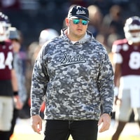 Maroon and White Football
"Not good enough": Jeff Lebby answers questions of performance and job security following blowout loss to Auburn
-
05
 Maroon and White Football
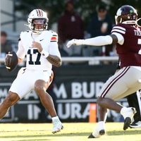
Rapid Recap: Auburn 41-9 Mississippi State