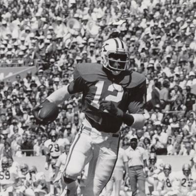
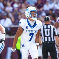
No Power K please

BlueVelvetFog

Heisman
Apr 12, 2016
14,602
20,276
78
I can kind of see the OPs point. We dropped the Power K after Curry's last year and with Mumme and some excitement we switched. The Curry years are still etched in my mind, but I'm willing to go along with it.
 

BigBluefoot

All-American
Jul 4, 2025
2,146
7,527
113
Ii really don't care what it is as long as we do something different every now and then. Hell, it seems like the dirty birds have a new helmet every other game. Power K, all blue, all white, or just KENTUCKY written across the helmet. Dont care, just would like to see something different. Not sure why this university and or Nike seem reluctant to make any changes outside of the chrome helmet..
 

UKGrad24

All-American
Apr 2, 2024
3,077
7,706
100
If you don't like the power K and actually like the modern interlocking Houston logo or the new birds wildcat sit the f down and don't comment on gear. Stein knows what looks good he's been showing you since he got here. We are not going to wear butthole barnhart scrubs you can go follow wherever stoops is and have the navy pants, black UK shirt, and 2006 UK hat with a fishhook on the bill. You're not missed.
 

Mad Max

All-American
Nov 28, 2015
4,198
7,834
93
Joseph Sikora Smoke GIF by Power
 
  • Like
Reactions: *Fox2Monk*

Mad Max

All-American
Nov 28, 2015
4,198
7,834
93
Sure it's nostalgic, but its nostalgic for getting beat to death every year. How many good memories do we have celebrating with that K on the helmet?

We possibly have a great coach and theres a possibility we might be making historic runs in the years coming up, this would be a great time NOT to drag up basic boring letters that represent the states team. How about a new one, even the old school wildcat.

The old wildcat looks 10 times better than the K.

Maybe im just shell shocked from getting annihilated every season seeing that on the helmet. Regardless, it sucks. The 1980's called and said put it to bed.
Just tell them if we avoid the power K, their wildest dreams will come true.

thats what id do.
 

UKSanders

Senior
Aug 27, 2007
428
850
93
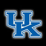
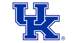
I actually preferred the interlocking UK with the "Power K" font compared to the new one. It was also unique/recognizable...blows my mind they paid so much money to switch from this:

1790943099817.png

to this:
1790943143531.png

The original one was SO MUCH BETTER
 

Smeegs

All-Conference
Nov 19, 2025
1,232
3,495
113
Even a plain chrome helmet look fantastic.

Ugh …the chrome helmets are awful. Comes across as just a tacky move that programs with no tradition do as a desperate gimmick.

What I’ve picked up from this thread is that you have crappy taste.
 
  • Like
Reactions: Anon520599

CutNets

Sophomore
Jan 13, 2026
84
194
33
If you don't like the power K and actually like the modern interlocking Houston logo or the new birds wildcat sit the f down and don't comment on gear. Stein knows what looks good he's been showing you since he got here. We are not going to wear butthole barnhart scrubs you can go follow wherever stoops is and have the navy pants, black UK shirt, and 2006 UK hat with a fishhook on the bill. You're not missed.

Damn this is good. I said early in the thread that we have the same logo as Houston and it's just flown over everyone's heads apparently. I'm aghast at the people so indifferent on this. The Power K is a no-brainer. It's uniquely Kentucky. NO ONE ELSE HAS IT. I actually hope we don't go back to the interlocking UK until 15-20 years down the road when the fans are opining for it as something "new".
 

Smeegs

All-Conference
Nov 19, 2025
1,232
3,495
113
Damn this is good. I said early in the thread that we have the same logo as Houston and it's just flown over everyone's heads apparently. I'm aghast at the people so indifferent on this. The Power K is a no-brainer. It's uniquely Kentucky. NO ONE ELSE HAS IT. I actually hope we don't go back to the interlocking UK until 15-20 years down the road when the fans are opining for it as something "new".
This. The problem with the interlocking UK is it looks too damn similar to countless other interlocking logos that’ve been out there. There’s nothing distinctive about it. Why should we want that? Great programs like Alabama don’t try to copy others, instead they maintain a traditional unique look that the public associates ONLY with them.

That’s what the power K can be for us. Nobody else has it. It’s uniquely ours.
 

Chadrock

All-Conference
Jul 12, 2004
3,127
2,169
103
This. The problem with the interlocking UK is it looks too damn similar to countless other interlocking logos that’ve been out there. There’s nothing distinctive about it. Why should we want that? Great programs like Alabama don’t try to copy others, instead they maintain a traditional unique look that the public associates ONLY with them.

That’s what the power K can be for us. Nobody else has it. It’s uniquely ours.
I’m sure the prior brain trust thought that UK would be better and win more games because of the logo change - 🤮

And don’t forget the wildcat logo that looks like two birds doing it missionary style.

Power K all the way!
 

3 Putts

All-Conference
Apr 25, 2025
1,683
3,894
112
Not only do I hope we bring back the power K I hope it stays forever and becomes our main

my favorite hate of all time is that white one with the blue power K. I hope they make it in a fitted version

Yeah, I like the Nike cap they have but the larger K is sweet.
 

TheBlueMist

All-American
Feb 5, 2004
2,191
5,267
113
I'll take the Power K, row of drunk wildcats, or the phallic tongue logo over our current Houston rip-off and fornicating birds logos.
 
KSR

Latest

  1. 01 KSR Football SEC Availability Report: DJ Miller good to go against No. 10 LSU
  2. 02 KSR Basketball KSR's top takeaways from Mark Pope's Q&A with Lexington Rotary Club
  3. 03 KSR Football Kentucky has been live underdog against top-10 teams
  4. 04 KSR Volleyball Gut Check: No. 4 Kentucky volleyball saddles up after Florida stumble
  5. 05 KSR Basketball What to know about next week's SEC Basketball Media Days