Recent content by elgribbo
-
E
New UK Nike Logo
I'm ok with the chequered side lines and the font they used there but I agree that the new UK at center court blows. the K looks funky. Not real sure why any of it needed to be changed really.- elgribbo
- Post #47
- Forum: Rupp Rafters - UK Sports
Latest
-
01
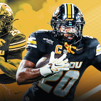 On3 Football
From sidekick to star, Jamal Roberts stepped up when Missouri needed him most
On3 Football
From sidekick to star, Jamal Roberts stepped up when Missouri needed him most
-
02
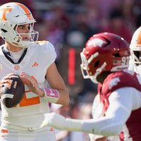 On3 Football
Tennessee QB George MacIntyre expected to start vs. Alabama
On3 Football
Tennessee QB George MacIntyre expected to start vs. Alabama
-
03
 On3 Football
College Football Playoff nearing deal to expand to 24 teams
On3 Football
College Football Playoff nearing deal to expand to 24 teams
-
04
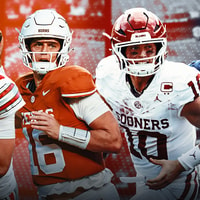 On3 Football
College Football TV Ratings: Tracking the Top 10 most-watched teams of the 2026 season
On3 Football
College Football TV Ratings: Tracking the Top 10 most-watched teams of the 2026 season
-
05
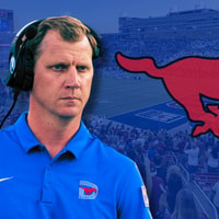 Rivals Football Recruiting
SMU will host several elite 2028 and 2029 recruits for Virginia game -- and leads for many incoming visitors
Rivals Football Recruiting
SMU will host several elite 2028 and 2029 recruits for Virginia game -- and leads for many incoming visitors